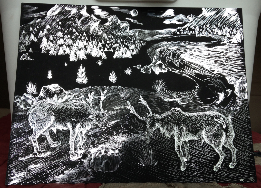
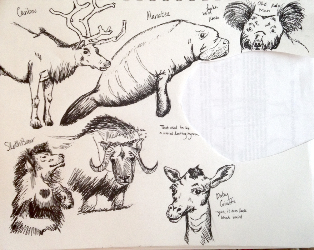
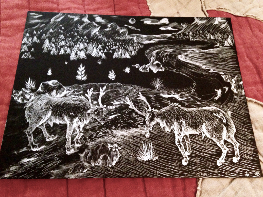
This project was done on scratchboard and we had to show movement and texture. My idea was to do Caribou about to spar in a tundra enviornment. I found this project to be extremely time consuming and I got a little impatient after a while with scratching. I really like the rocks in this scene; they were fun to do and you could really place them anywhere you wanted. Another thing I like are the caribou themselves. The fur on them was a lot of fun and you could show the grain of the fur by the direction you scratched. On the right side of the board, I didn't like what I did with the ground and the grass. I feel like it would have looked better if it was left darker or even just the black like the other side. Also the stream, I got a little impatient and the scratch tool wasn't doing it's job very well so it ended up looking a little bad near the end of the stream. Overall I think it was an okay project. I'm not a huge fan of the scratchboard and it would take a lot of patience to do one really well. I liked how it turned out, although there are some things I could have done better.
This project was our self portrait project. We had to come up with an idea thay demonstrated either a strong emotion, a zombie take on ourselves, or ouselves part machine. I chose to do machine in pencil mostly because I've always loved the look of mechanics and the face that there's a lot you can do with the theme. My general idea was a pulled apart face that was attached to a metal stem. This grew a little more into the face pushed out and being controlled by a heart as a brain. I mostly did the heart as the brain becuse I feel like most of the time that's how I think and not only that, but it looks really cool too. This was the beginning of my outline. I got the shapes of the head by printing my head out and cuting it all up to get the right proportions. I then placed them scattered apart and drew the heart in. The proportions had to be right and the placement done well for the whole thing to look good. When I started shading the heart I actually got really excited because it was looking sooooo cool. The veins on the heart were really fun to do and gave the heart a whole other deminision. Another thing with the heart and stem, growing along the stem are veins leading up to the heart. I really liked doing that too becauae it gave the very flat mechanical outline something natural and living. A little contrast and I think that's why I like the heart brain so much. The other parts being done were the nose and mouth, but unfortunately I don't have a picture to show the progress. Basically I just started shading the nose and mouth. Both of these were a little difficult for me to draw and shade mostly because I'm not too familiar with showing the roundness of the nose of the plumpiness of the mouth. On the nose, I do like the way it turned out with using a sort of circular strokes on the places it seemed to curve around. The next thing to start on was the major parts of the face, starting with the eye. The eyes were fun to do, mostly because of all the different values you can use to show the roundness of the eye and how it's being covered up and how it's a little shiny. It's just really cool to show that texture through just a little pressure differences. And nowwwww... BAM. dun So this is the final product! I really like how it turned out. Using pencil made it look kind of soft but still gave it a sharpness where it was needed. My favorite parts besides then whole thing are the heart and the broken eyes. I really like the shading on both of these and how I could achieve those different shapes and textures just by varying some pressure. I really enjoyed doing this project and I think it's been one of my best and one of the most interesting ideas I've had. It was executed well and I just love how it looks. This project was a transparence project as well as practice for the chalk pastels. This project was kind of challenging becuase it was really hard to get the right level of color and the right color of the smarties. Blending the colors and using different colors to show shadow was hard to get down. The colors are a little too dark for smarties. One thing I do like though is the wrapper part, especially the end parts. The twists at the end were fun to do and show the transparence. I think the white too on the wrapper to show the light reflection was done nicely. This project was a good practice for working with the pastels and taught me how to belnd colors to show shadow and depth along with using white to show the transparency. This was a prisma color pencil project where we had to draw dum dums. I chose a watermelon lollipop because it had some really cool color in it and the color of the candy showed through the wrapper. This was a little bit difficult for me to do. The colors were hard to blend with the white to get the right shade. With prosma colors I always go a little too dark so it gets harder to blend them as I go. The overlapping pieces of the wrapper are my favorite parts mostly because I think it's really cool to show shadows. With these shadows they have a little color in them too because of the candy underneath and the pictures on the wrapper it self. Another thing I like is the stick part. I think that turned out pretty well and it has the right angle. This project was a good practice for blending and using color to show depth. Overall pretty successful. Our project in color was to draw something with opacity using colors. It was a little difficult trying to find an idea that uses opacity. I kept thinking all of the things I were picking out were just too simple, normal, or boring. It took me a while, but I ended up getting my inspiration fromm violet flower lollipops. I loved the idea of a floral lollipop with the actual flower inside and drawing them seemed to be a little different and a challenge. I looked up edible flowers for the pops and see what colors complimented them to decide what colors to use. I chose to use colored pencils/prismacolors for this drawing since I had a little experience with them, but I wanted to grow more in that experience. When drawing with prismas I tend to go too dark too quickly and don't blend as smoothly as I should. Overall, I'm pretty happy with it. It's definitely colorful and I really enjoy it hanging on my wall currently. 😄 My first homework was a contour line drawing of a plant with detail. I chose to draw Regenald. Regenald is an Asian money tree and he's a wonderful plant. He's well manered, and loves to grow. He's actually cracking the pot he's in right now, my boy's growin up. 😌 The use of contour lines gave a nice dark outline of Regenald and shows the dips in his leaves and trunk. My second Homework was an IZZE bottle and coconut brownie wrapper using pencil shading. This was very difficult for me. The IZZE bottle was clear with a clear label and the frosting on the brownine wrapper was difficult to convey using pencil shading. I chose to do pencil because I thought it would be more of a challenge and it was different from the homework before. My third homework we had to draw cans and bottles. I had two bottles and can and drew them in pencil. I chose to do pencil again and try and see where I could improve. Pencil still frustrated me a little, but I think I caught on a little more than I had last time. I still need to work on blending my lights and darks, my can seemed a little too light at the shaded parts. I hope the more I do sketches in pencil the more I'll gain from them. This is the fourth homrwork which was dishes in a drainer. I decided to use pen because it was different from my last homeworks and it can achieve shadows quickly. It also looks a little un-natural and not as smooth as pencil and other medias. My favorite part of this is definitely the cup, it looks the best and the shading is right. This is my fifth homework and it was a grandfather clock in colored pencil. I chose to do my clock in three different colors showing the different light values. The green was the darkest, the purple the highlights, and then the the blue is the middle value. This was a lot of fun to do mostly becauae I never really do colored things and it was fun to experiment. The sixth homework was to find objects unrelated to eachother and draw them arranged together. I did this one in pencil and it's a bagel and a phone. I chose these because I was at lunch and I used my friend's phone and her half bagel. It turned out to be really light and there's not too much shading. I also find it really difficult to draw opacity, so the plastic bag was a little difficult. This was a random arrangement made glorious by me. I like it. My seventh homework was to draw an arrangement with food. I did this one again in pencil of a grapefruit. I absolutely love grapefruits so why not draw a weird one? The textures were fun to play around with on the cut side of the grapefruit. The rind inside, the non flesh part was really cool; those are all little tiny circles. Also, drawing the flesh seems extremely ramdon at first, but you begin to see a pattern within it. And although there was a pattern, you could do a lot with it. The background of this was simple, just a tin jar that I have many of in my kitchen. Overall, pretty cool homework and fun to do. The eighth homework was to draw animals. For this homework I used pen because it gives deep values really quickly. I tried to pick some interesting animals, well, animals that looked kinda weird. The manatee and the baby giraffe were probably my favorites, mostly because they just look so strange. I had a lot of fun with this homework but I tried to draw a hyena and it just came out looking too weird so I cut it out; it didn't go very well with the other animals. While drawing, I learned that it's kind of difficult to draw really shaggy things. The muskox looks a little strange because of that but I feel it just needs more shading/texture. Overall a pretty cool homework, and fun too. Homework number nine was to design and draw any kind of vehicle. This was a quick homework for me, but ot was fun. I took my inspiration from love of steampunk things and an older style buggy car. I like the idea of a hovering car so I designed one. The first big sketch was really rough but it got the general idea. The other right two were more refined and from different angles. My steam buggy is slender but has futuristic movement type. I liked this idea, it's a little simple but I enjoyed drawing it out. Drawing an objext of interest was the tenth homework. My object of interest was my stuffed animal bunny. It was really fun and weird trying to draw it in different angles. It has a lot of bumbs and those are a little difficult to show just by value. The whole shape of it is really strange and lumpy so it was actually really entertaining trying to draw all of it. Most of the views were from the front just because and they turned out being sort of rough sketches. I chose this object because it will always be something of interest to me. Homework eleven was the study of feet. You necer notice really how weird looking feet are until you have to draw your own. At least on my feet, there were a lot of grooves and then some wrinckles when bending them. When drawing those there is a ton of shadows and lots of different values to express. The heel of my food was kind of hard to shade because the shadow covered most of the heel. I really like the toes in the main middle foot. They're stretched out and in a bent shape. It gives them dimension. The toes on the bottom foot are not very good, I don't do very well with nails. Overall it was weird but fun to draw my own feet and they turned out pretty good. This project was done using eggs in dramatic lighting with neu pastels. I really enjoyed drawing these using the pastels, there were nice to work with. The can blend into eachother really well and you get vibrant color with them. These eggs were colorful to say the least. I tried to find diffrent ways to use the color contrast to portray the lighting. Some worked out, others not so much. Although I like all the color combinations, I feel that they could have been blended better and definitely more vibrant. After I sprayed them, I realized that they were quite blended enough, but they turned out alright. This drawing was done for the "Look at that View" project. This was done in pencil. The goal was to create an interesting perspective composition. I chose to do a drawing of me typing. I've never seen anything done from underside a keyboard, so why not do it? It was interesing but difficult composition. It was quite hard to get refrence pictures from such a small area and in such a weird place. The angles in this view were also very specific, so taking my own pictures and trying to get the right angle proves to be quite a challenge. This was the outline for the whole drawing. It took me aaaaages to get the angles the way I wanted them and to get the hand just right. Although it took a long time, the composition I was extremely happy with. The main focus here is the underside of the keys and then the typing hand. In the background my room is there and really cool. I really like my room. I really enjoyed seeing how the outline turned out being it was really difficult and time consuming to draw. And now... This is my final drawing with all the shading. I'm pretty content on how it turned out. I think the keys turned out really well and they're nice and dark. The hand I believe could use a little more shading; from far away, the shading doesn't blend as well as I'd hoped. The background turned out pretty nice if not a bit too light. There isn't much going on on the walls and I think I like it that way since it doesn't take too much away from the main focus of the hand and keys. Over all, this was a really interesting and fun project and I think I did pretty well. This project was done with pencil and we had to pick a view from the table to draw. I took a picture of a part that has a skull with bottles and plastic horses in the background. I chose pencil for this poject because it game me a chance to practice and challenge myself with the bigger areas and fine detail shading. This was the beginning when it was outlined and ready to be shaded. I actually began with the details and I think this is where I went wrong. I feel as though I should have started shading the bigger areas and then gone to do the fine detail after that. Shading the larger areas would have given me a chance to blend the deeper areas and higher areas better. It could have transitioned a lot better, a lot smoother. Also pushing some of those lights and darks a little more, especially near the middle, could create more depth within my drawing. Here is where I really started to get kinda rushed and I was getting frustrated with the big areas and how they were turning out. I stopped for a while and tried to slow down after that. I had started out shading really dark and it was very uneven. I tried to go reallu fast as well, and I payed the price. It began to look real sloppy, so I decided to take a break and come back and touch up a little bit and hopefully make it look smoother. This is my final picture. I tried to go back and salvage my rushed parts, especially in the horse section. The one part that I particularly have trouble with, is the crack in the middle of the skull. I wasn't quite sure how to make it look like it was a crack. I'm still not quite sure how I could have done that differently to make it look more clearly like a crack in the skull rather than just a bunch of dark and light parts. Overall, I think it was a nice challenge and it turned out alright. I really like the skull part of it, being the most intricate of the picture and the main focus, it looks quite nice. 😊 This is another one of our charcoal projects. It was the first time we did white charcoal on a black background. I liked having to draw the highlights and using the paper for the shades. Using the charcoal created quick and bright highlights on the black background. |